Red Gold Tomatoes
PRINT & EDITORIAL DESIGN
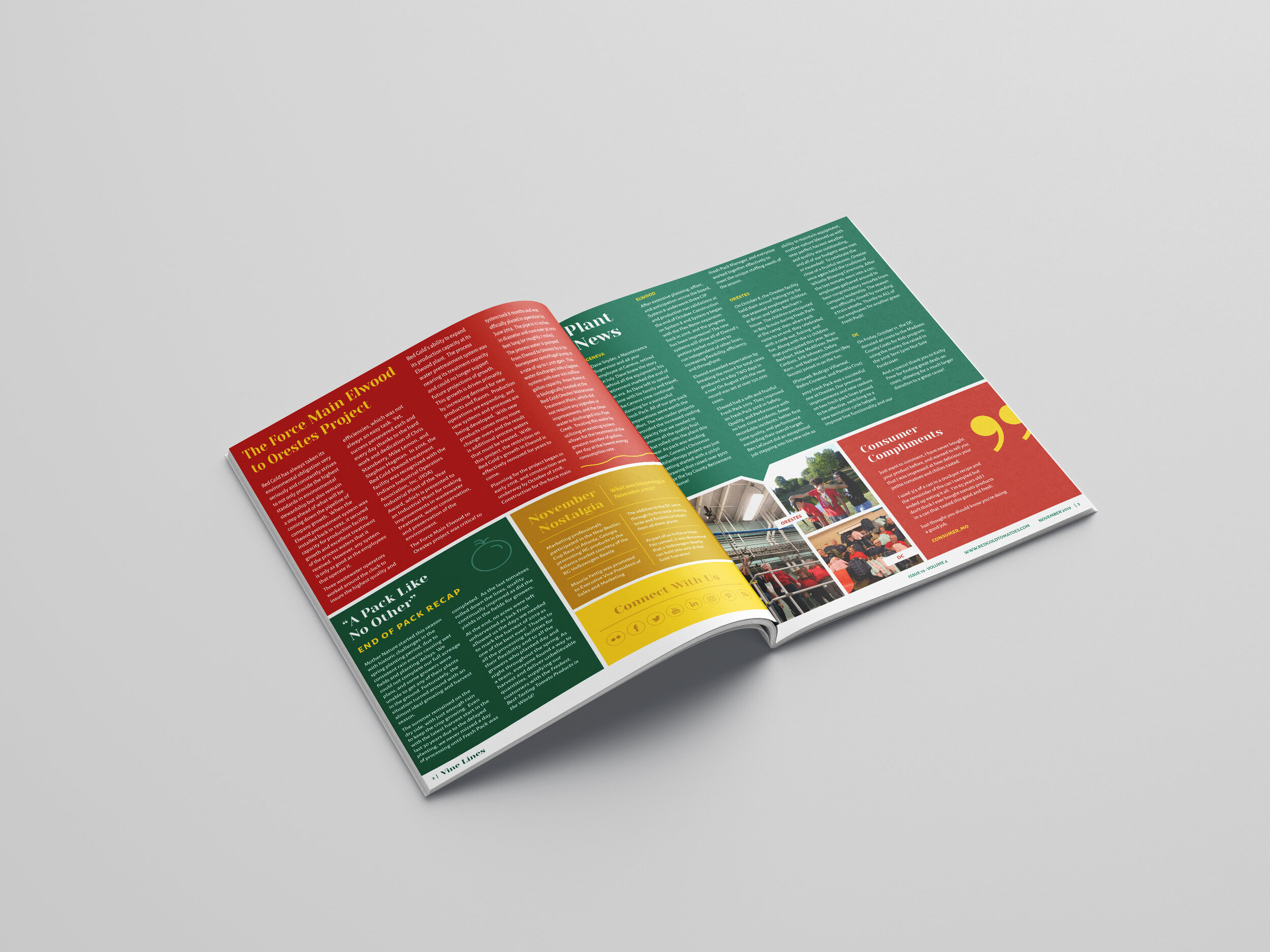
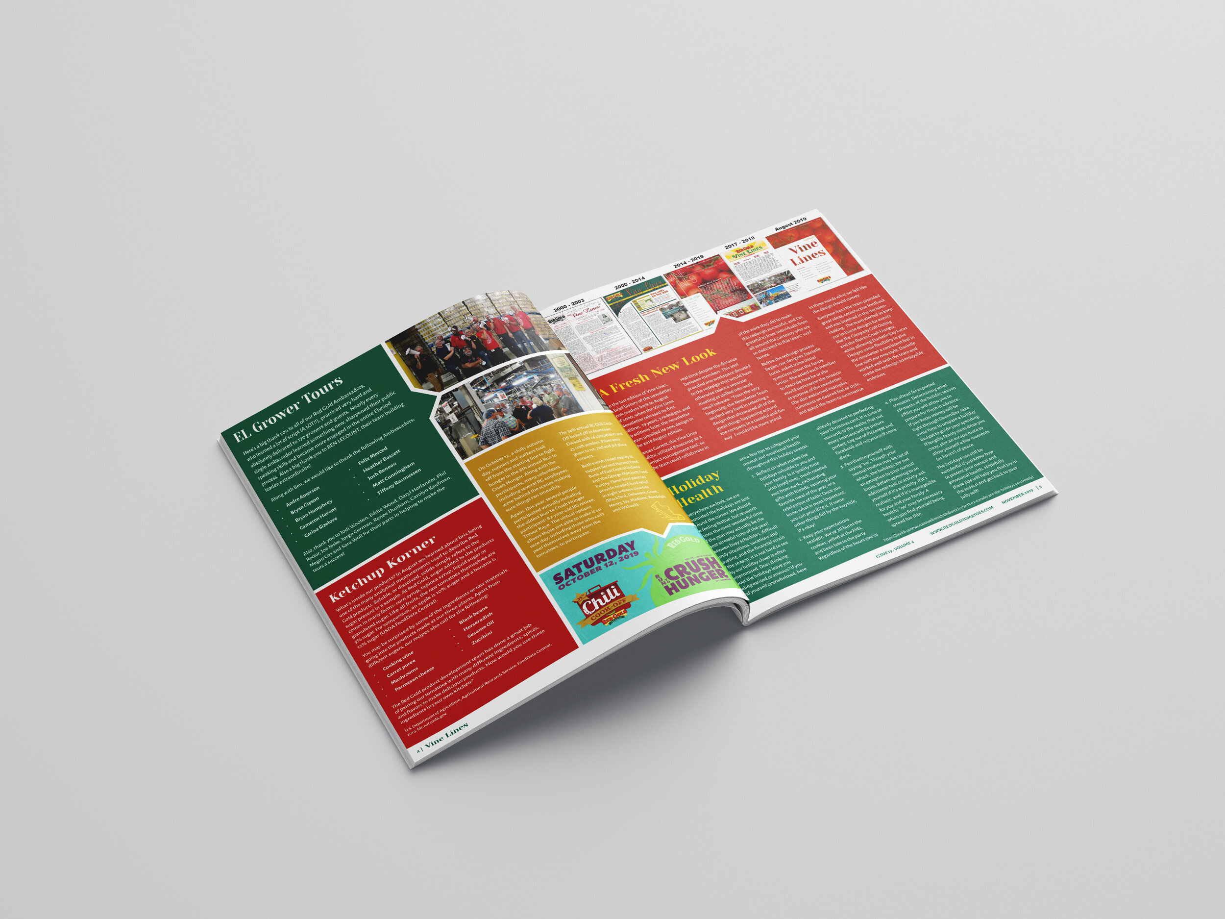
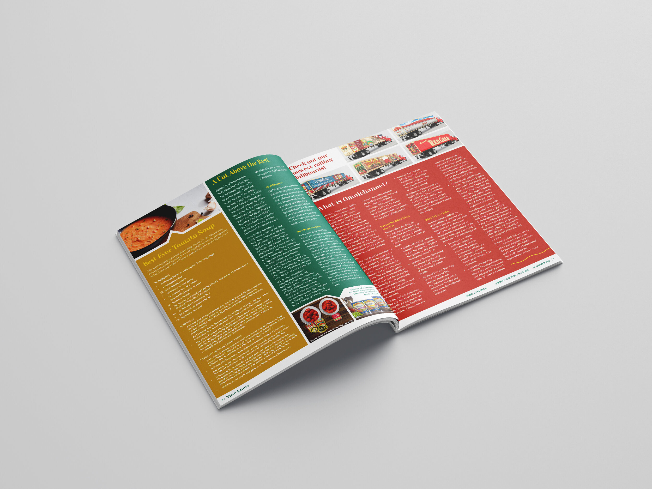
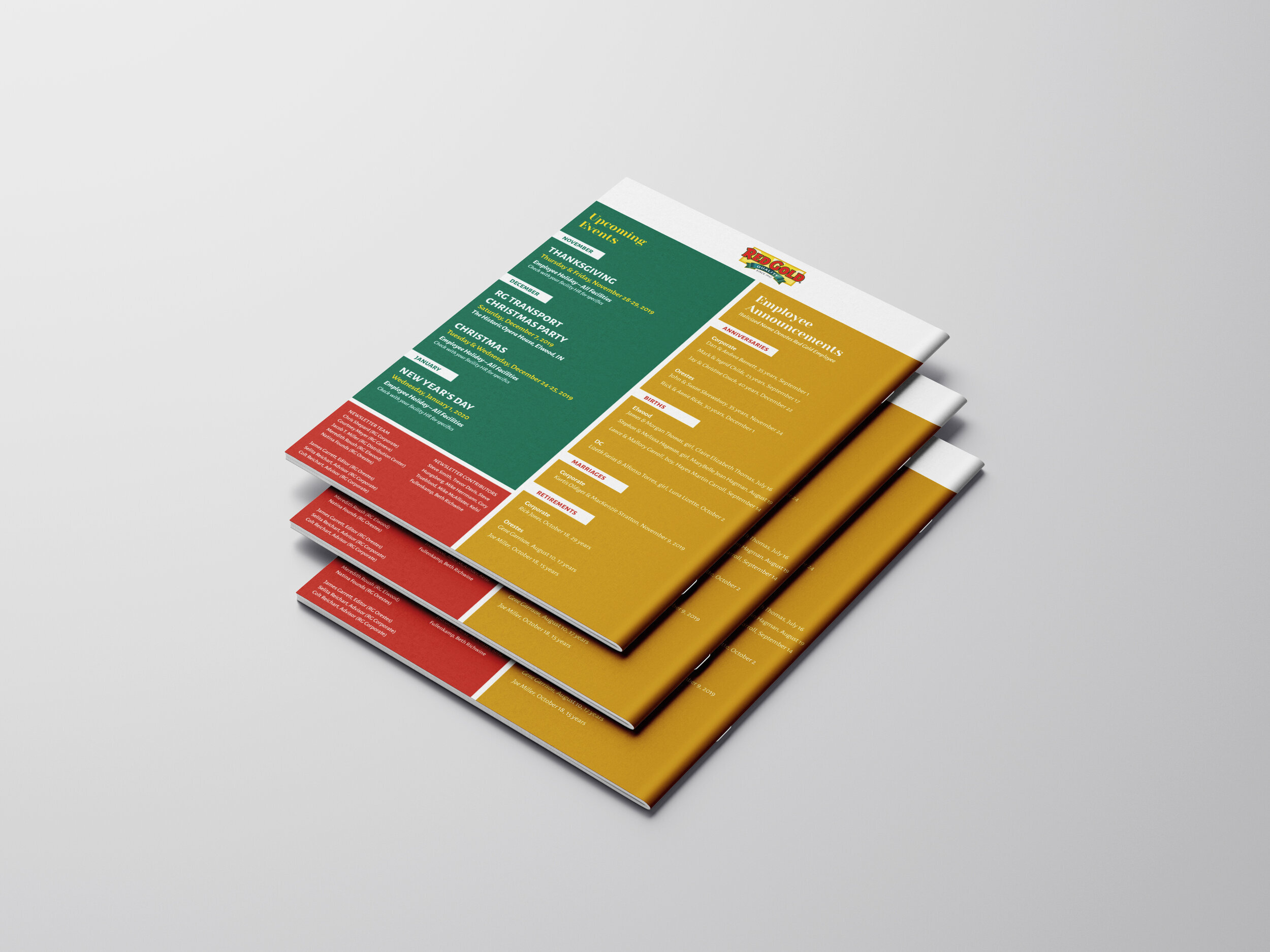
We had the great opportunity to work with team at Red Gold Tomatoes to redesign their 8-page newsletter/magazine that goes out to thousands of employees. The number and length of articles changes with every issue, which was the primary problem to solve for. We designed the newsletter on a flexible 4-column grid, with containers for the articles that can expand or shrink based on the article length. We then fit them together like a puzzle. The cover, brand colors, fonts, and basic grid structure stay the same each issue, so while the layout may change, the design system remains intact.
When we were planning the redesign, we asked the team to send me adjectives they wanted the newsletter update to convey. They said: fresh, colorful (red/gold/green), edgy, attractive, clean, balanced, energetic, fun, progressive, informative.


