Orange County Economic Development Partnership
BRANDING & LOGO DESIGN
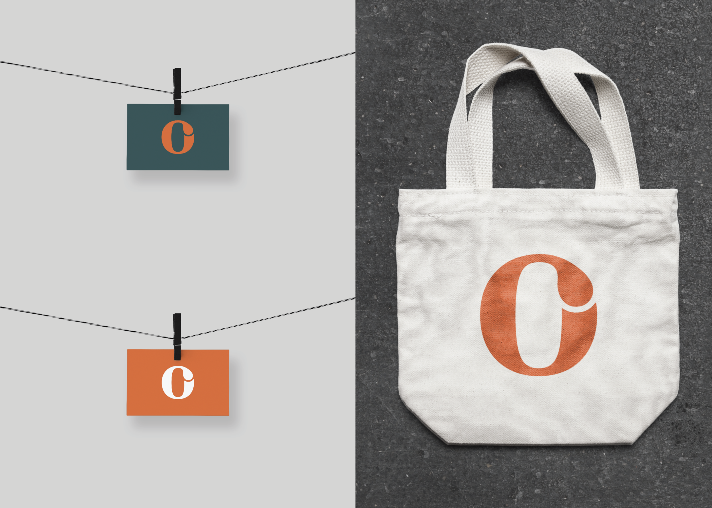
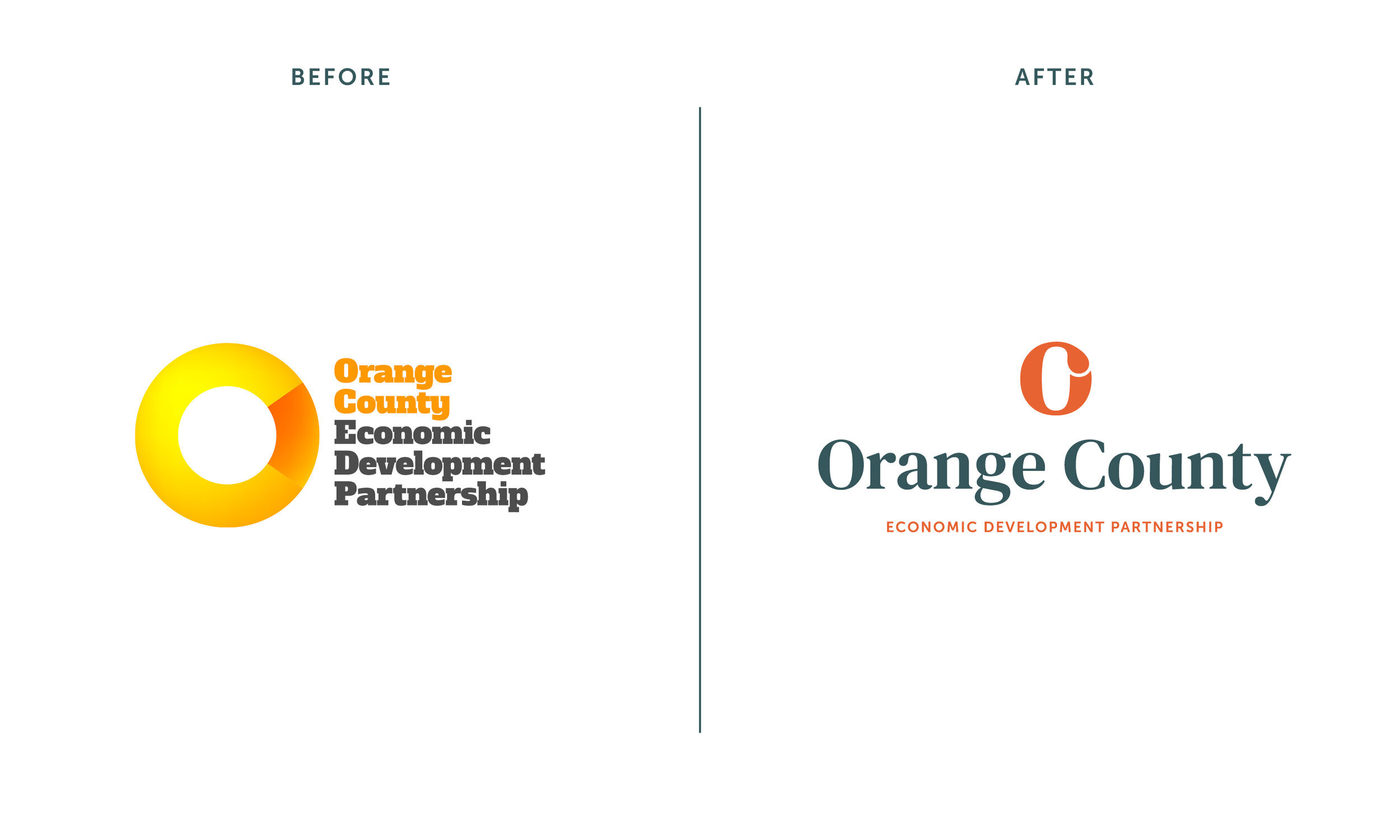
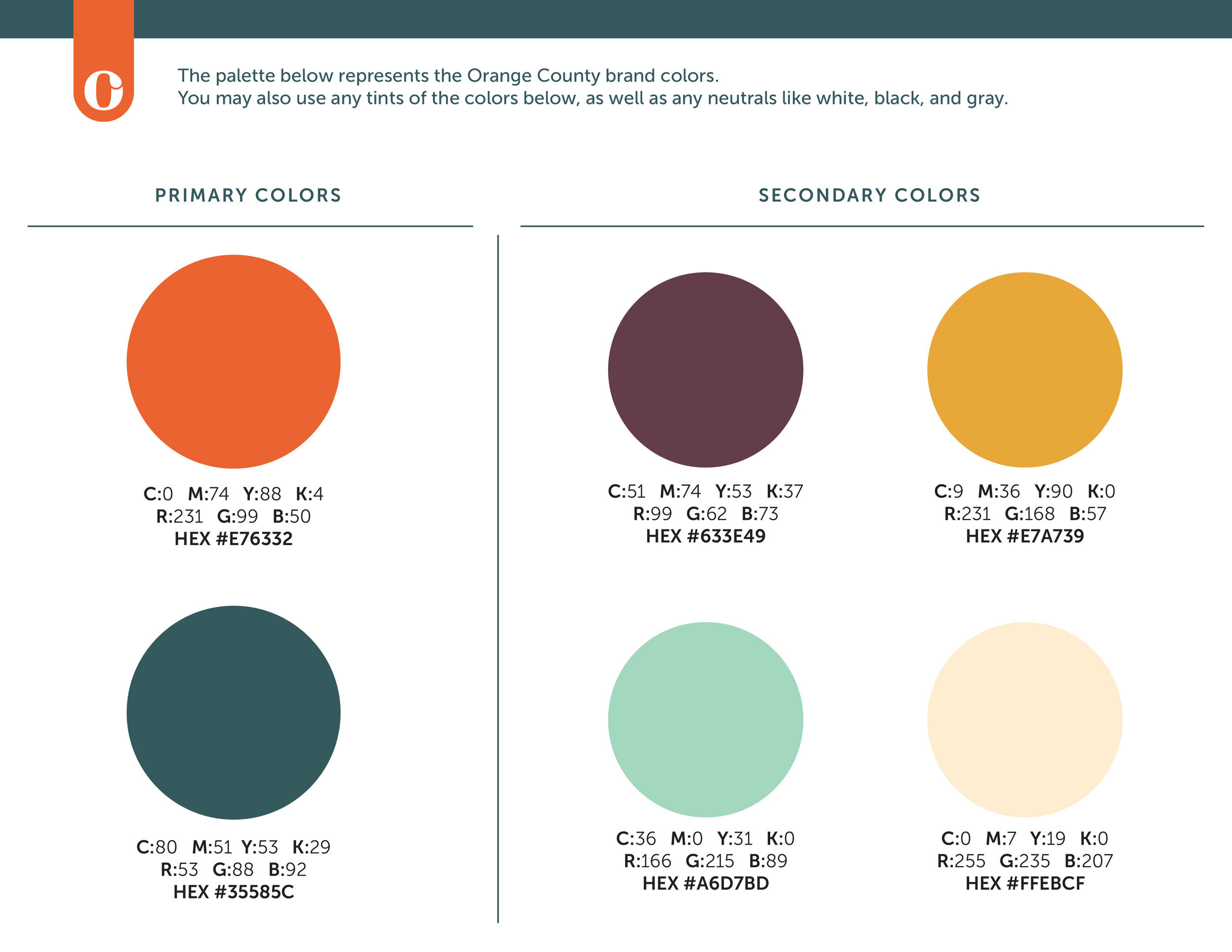
Orange County EDP was looking for a rebrand that felt more professional, trustworthy, and modern, with a mark that focused more on “Orange County” than the full name. We built them a timeless logo lockup, featuring a solid, formal symbol that still has a hint of playfulness, which will appeal to the large tourism industry in the county. The color palette is purposefully more bold than competitors in the industry, designed to stand out while still projecting an aura of trustworthiness and experience.
Project management: Blueline